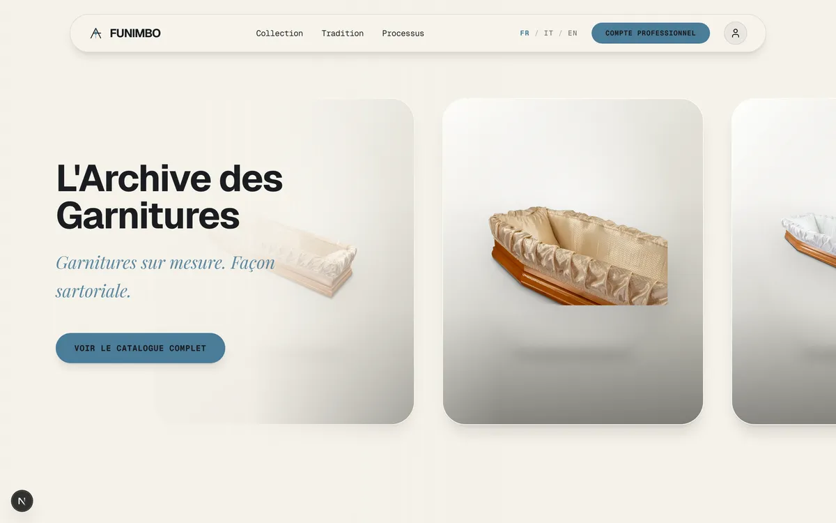
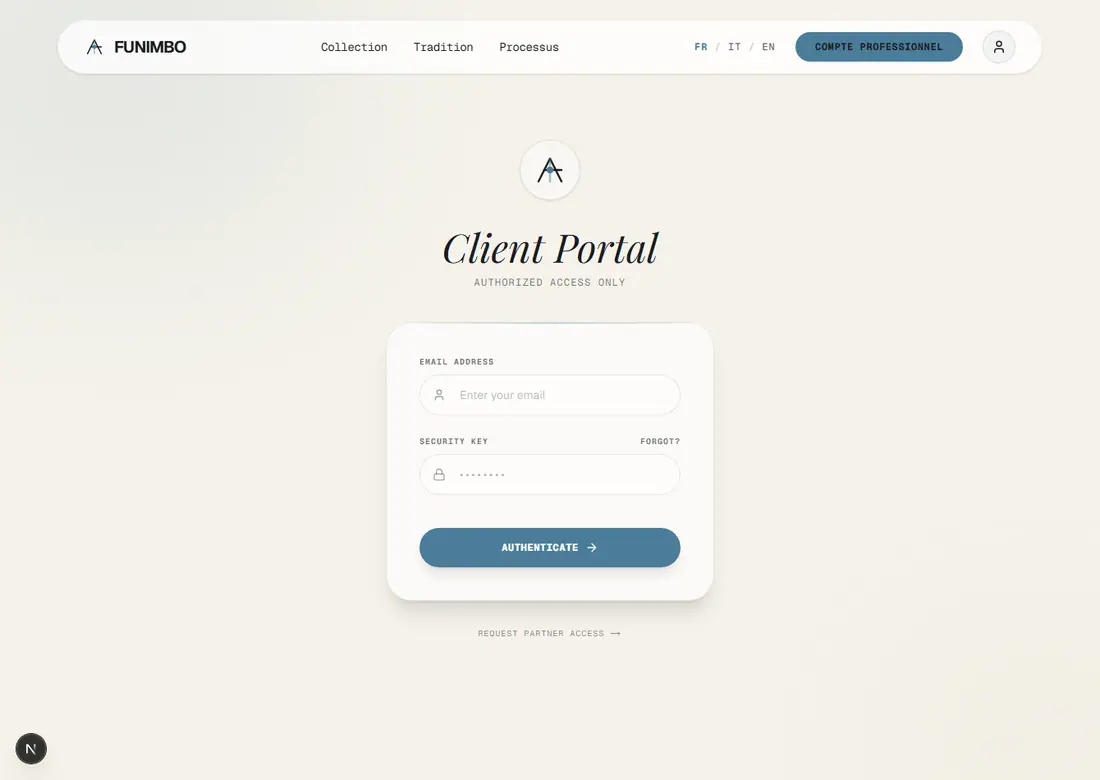
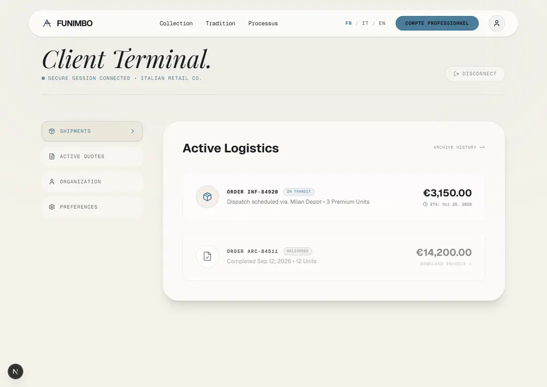
01New design — “Six pages, one direction”
The complete storefront built in Open Design: two landing variants + catalogue, product, cart and heritage. Shared funimbo.css.
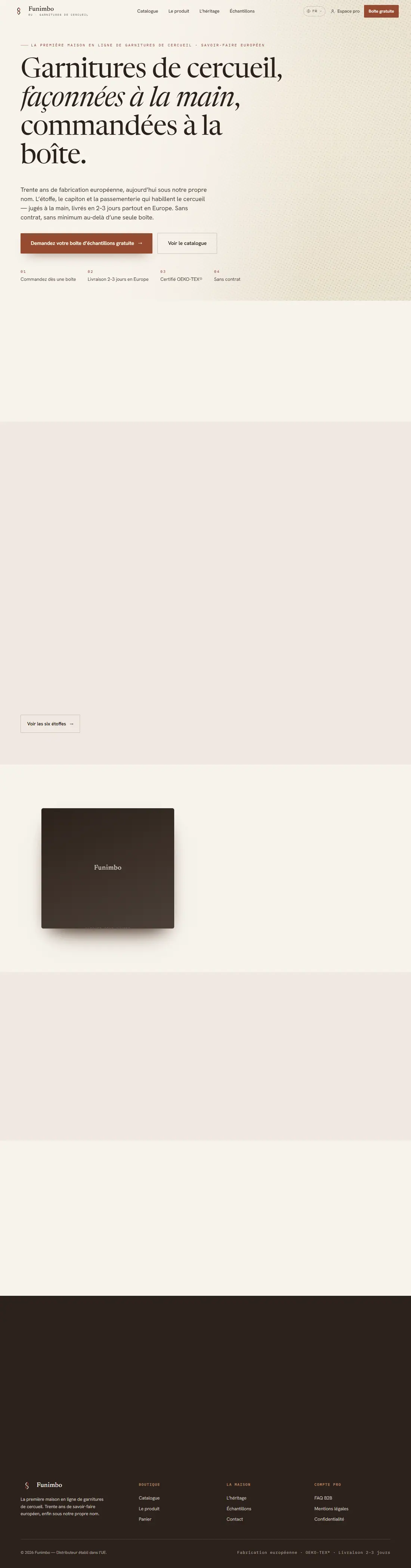
Landing — warmindex.html
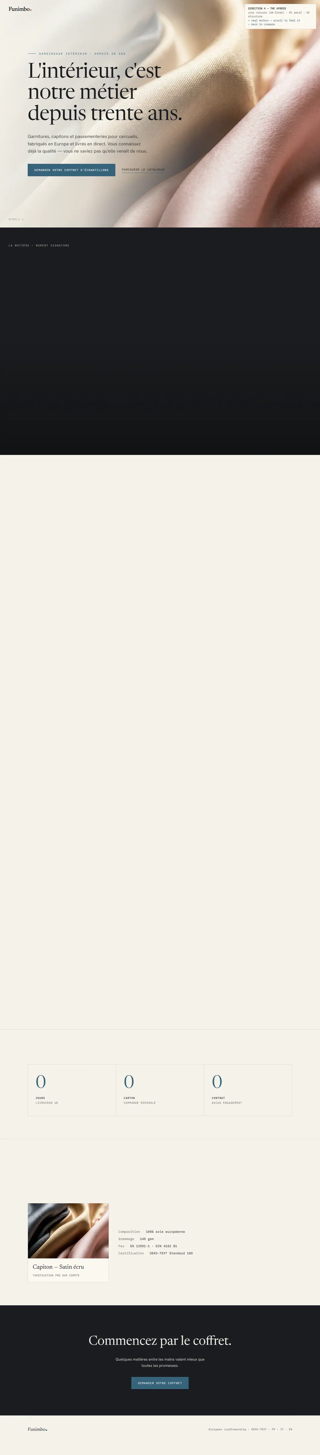
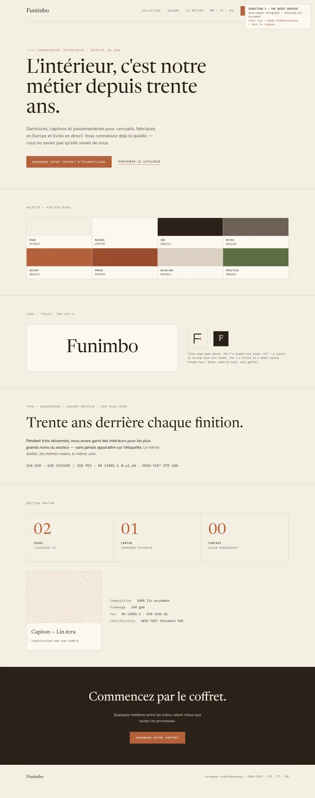
Primary landingWarm ivory + rust, Newsreader hero, trust row, the sample-box object.Open live →
Landing — editorialindex-v2.html
Landing variant (full)Italic serif hero, full nine-étoffe swatch grid, “30 ans” heritage block.Open live →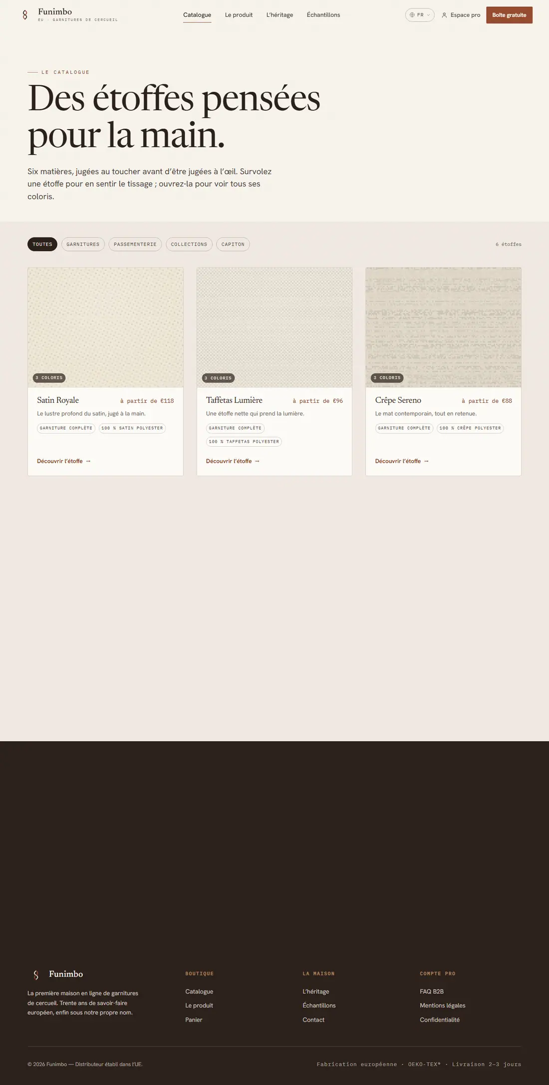
Cataloguecollection.html
Étoffe grid + filtersFilter pills, étoffe cards with “à partir de” pricing + spec lines.Open live →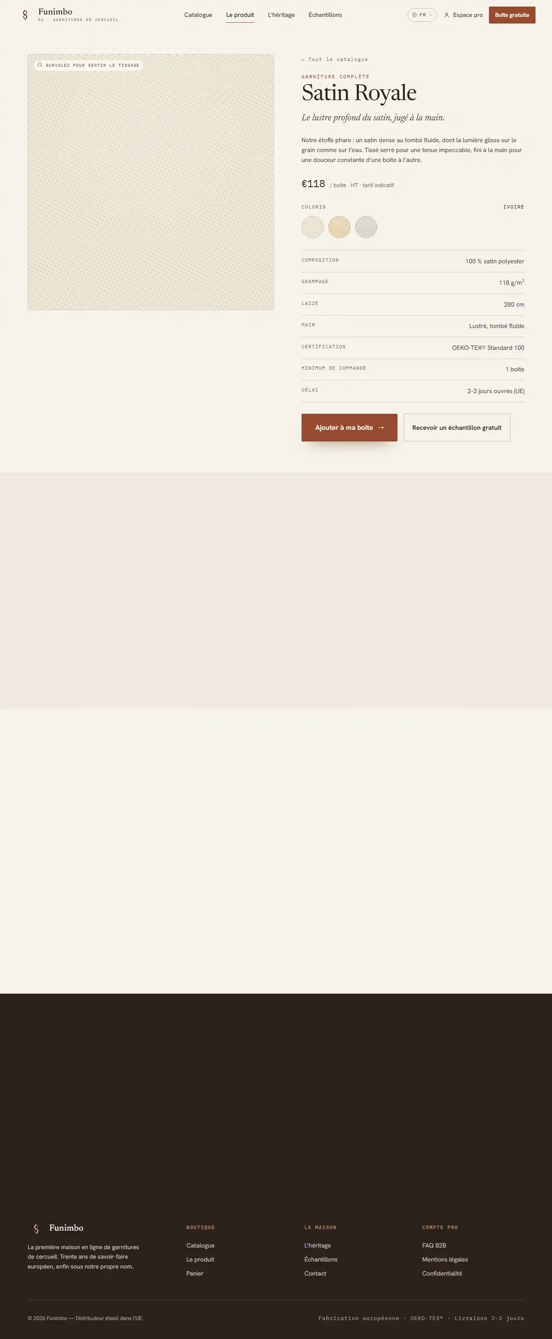
Produit (PDP)product.html
Spec-table productSatin Royale — swatch, full spec table, “Ajouter à ma boîte” + sample.Open live →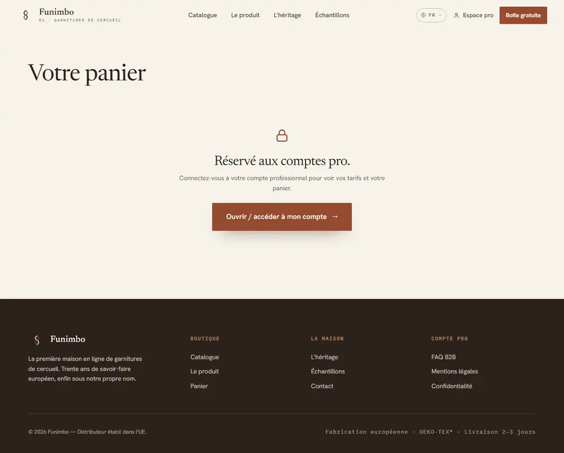
Paniercart.html
CartThe order-by-the-box cart surface.Open live →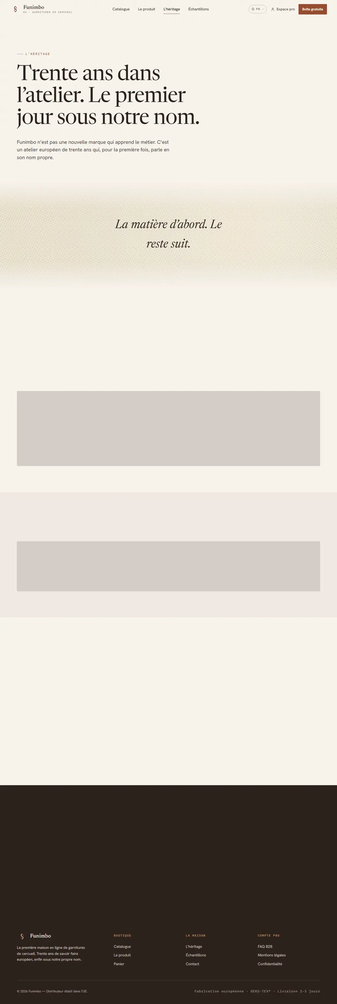
L’héritageabout.html
About / heritageThe 30-year story, European craftsmanship, the workshop.Open live →